A new web-based app developed by a George Mason University professor visualizes near-real-time data collected from media sources on the ground in Ukraine. The app allows users to filter an interactive map of rapidly developing events in specific neighborhoods throughout the besieged country. A link to the original media outlet accompanies each data point representing a military or nonmilitary event.
The map is called “Ukraine VIINA Dashboard” and is based on a dataset from University of Michigan professor Yuri Zhukov’s Violent Incident Information from News Articles (VIINA) project.
“Our app visualizes geolocated media stories from the event data,” said Robert McGrath, the Schar School of Policy and Government associate professor who created the app. “We think that journalists and citizens following the war will find it a useful way to access primary sources in a visually appealing way.”
McGrath, a political scientist and instructor of research methods and data science tools, had been “obsessively reading about the war on American news outlets and on Reddit, and I was thrilled to have access [from Zhukov’s data] to all the Ukrainian and Russian sources that are reporting ‘on the ground.’”
He was encouraged to bring his computer coding skills to task by fellow Schar School associate professor Eric McGlinchey, who secured Zhukov’s cooperation with the app.
“I see this as very much in the spirit of ‘activist social science,’” McGlinchey said.
“The app presents readily understandable information to English-speaking audiences who otherwise could not make sense of the Ukrainian and Russian data sources,” he added. “Equally important, our app has a good chance of flying under the radar of Russian state censorship, allowing audiences in Russia a clear picture of what truly is happening in Ukraine.”
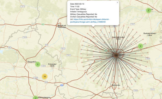
The numbers and colors on the map indicate how many events/stories there are in that area. Red indicates more events; green, fewer events. Users click a cluster to zoom to the area; another click zooms even closer to the location of the media report.
“Eventually, when you drill down enough, you’ll see individual nodes, which represent actual news stories about an event that took place there,” McGrath said. “When you click a node, you’ll see metadata about the event, often including a link to the actual story.”
McGlinchey added that the professors are also working on a database of war crimes committed during the Ukraine crisis and another app that geolocates and provides data on those war crimes.